Welcome

Welcome to my A2 media coursework blog, my name is Alice Cahill (0130)
I'm working in A2 Production Group 1 with Gavin Fraser (0245), Mahalia John (0345) and Kayvon Nabijou (0610)
Within the sidebar of my blog you can access a live link to The Latymer Media Music Video Blog, the archive to all of my posts and the labels to the A2 Preliminary Task, A2 Research & Planning, A2 Construction and A2 Evaluation

Thank you for taking your time to look at my blog.

MUSIC VIDEO

^Our Music Video
some_text
^Our Digipack Album Cover (Top to bottom, left to right: inside back, inside front, back cover, front cover)

Our Website

^Click Image to go to Our Website in a New Tab
Showing posts with label A2 Construction. Show all posts

Friday, 19 December 2014

Editing: Final Adjustments

Once we had finished grading the video, there were two things that were pointed out that we thought that could be improved.

Firstly, Gavin thought some of the shots felt a bit empty, as some of the wide shots had a lot of space around the outside. A good example of this being the Monopoly setup.

Before scaling up
To fix this, the shots were scaled up by at most 15%, otherwise the loss of quality would be obvious.

After scaling up
It was a subtle difference, but it did make the shots seem less empty overall.

Secondly, ever since the steal-o-matic, we wanted to add a title. We decided to add it to the last shot. We wanted to do this for two reasons. Firstly to have the Pilgrim logo as the last thing the viewer sees in the video, to anchor the brand with the band's image in this video. Secondly, it was to give our video the ending that it needed.


It is a typical convention of indie-genre videos, which we picked up from a few different music videos.

George Ezra: Blame It On Me


Bombay Bicycle Club: Carry Me


Digipack: Progression 2

Back Cover

When following conventions on the back cover we could take influence from any album of any genre, as the conventions are followed throughout most genres.

The Vaccines: What Did You Expect From The Vaccines (Indie genre)


Ed Sheeran: +


On top of the barcode and track listings added a band website, band Facebook url, band Twitter account name, copyright, reference to record company (Alma Gavon Records) and parent company (Beggars Group).

We also changed the colour of the spine, as the lace texture made it difficult to read the Pilgrim logo, therefore we made is a block blue colour to add contrast.


Inside Covers

Our previous inside covers
We got some teacher and audience feedback on the inside covers we made. The main criticism 
was that the left panel looked too empty and that there were not enough pictures of the band.

To rectify this we moved the VHS photo of the band to the left panel and placed another publicity of the band in its place.

Website: Progression 2

Since the last post we have made significant changes to the website.

To the homepage, we have added more news and social media posts, along with a new sliding banner with four banners which links to different parts of the website depending on the subject of the banner. The first, 'Win' banner links to the competition page when clicked. The second tour dates banner links to the 'Tour' page and the store code page links directly to the store.

We added a 'Contact Us' page for fans who wish to contact the band and send a message, without signing up to the website. We hoped that this would make the user feel more connected with the band, also increasing interactivity.


We created a competition and made a page specifically for it, called 'Win'. This gives fans a chance to win a day with the band, a signed album and VIP tickets to a gig in London if they get involved with the music video and tweet their favourite toy as a child. This incorporates social media, giving the band extra, below-the-line advertising across another media.


A behind the scenes video was created which we all put a bit of time into editing. We found that behind the scenes videos is conventional for indie artists. We thought that they make the artist seem more real and genuine, and it can bring out more personality of the artist.

Examples of artists having behind the scenes videos:

Lewis Watson (indie): Behind the scenes of the music video 'Holding On'


Dan Croll (indie): Behind the scenes of the music video 'Nobody Knows'


Here is Pilgrim's behind the scenes video from the music video shoot for Talk Through The Night:


Next, we edited and added all of the publicity and music video photographs we took throughout the shoots and created two separate galleries for them.


At the bottom of each page, we added a fixed text and logo that read 'Alma Gavon Records'. There are also links to the privacy policy and terms and conditions related to the record company. There is also a contact us page for Alma Gavon records, showing the address, phone number and times the office is open, for users to call with questions for the record label.


Lastly, we had some feedback that the 'Tour' page looked quite empty as it had a lack of images compared to the rest of the pages on the website, which all had at least one picture. Therefore we decided to use the banner, advertising the band tour, on the tour page as well, which we thought worked well, therefore having visuals for every single page on the website.


Improving The Branding

Whilst getting some feedback from someone, it was pointed out that the blue, lace texture we use in the album cover and website is very memorable and noticeably used throughout (second to the white Pilgrim band logo). There was a problem for us because it was not our image and we didn't fully think though the connotations of the image and it's relation to our brand.


We decided to think again about our branding and list the characteristics of the band. Pilgrim are a fun, laid-back, quirky band. We (and others we asked) thought the lace texture was vintage, which we established is another quality of the band, adding to the quirky characteristic. 

Others also thought that the texture looks like something you would find on curtains or pillows at home, meaning that it connotes homey, cosy and welcoming feelings, adding to Pilgrim's inviting and approachable quality.

The lace texture is also fairly feminine, which is unconventional for indie bands, as they are conventionally more masculine to appeal to a male audience. We thought it is partly a reflection of Ash, the female bassist in the band.


Once we decided on the texture's meaning, we decided that we would rather make our own texture than have one we found on the internet.

Mahalia scanned in a variety of lace textures she could find. The three below are my favourite.


The left pattern was chosen, which we then edited in Adobe Photoshop by brightening. For the website, we thought there wasn't enough pattern, so we duplicated it three times and put the images side-to-side on mirrored edges to make it seem larger.


Below are the front cover of the album and a page of the website. The texture we used on the website is slightly more saturated than the texture we used on the album cover because the website needed slightly more colour to avoid it looking too dull as the colour scheme was made of greys, white and blues.


Wednesday, 17 December 2014

Grading

Once we had all decided on the final cut, we needed to grade the video. This included using the Procamp and Three Way Colour Corrector features on Adobe Premier. For most of the shots we had to increase the contrast and saturation, to bring out the colours and make the objects stand out.

Procamp feature

As everyone in the group had used these features before in our AS foundation portfolio project, we were all equally confident grading the video, therefore we all took turns.

Three-Way Colour Corrector feature
Using the split screen tool you can see the difference the grade makes to separate shots. It made the background colours and skin tones brighter and more vibrant.

For some shots, the background colour reflected onto the band's skin quite a lot, for example in the purple shot below. To solve this we had to use the three-way colour corrector to take out some of the purples by adding more yellow.


Tuesday, 16 December 2014

Editing: After Effects

There were four shots that we filmed that needed slightly more work on than the other shots, when it came to editing. The list made below are the shots that were put into after effects, as they had noticeable flaws that we wanted to correct.


Firstly the opening shot of the band needed stabilising, as it was very shaky. Secondly the track shot of the Nintendo 64 needed stabilising and the floor brightening, as it was visibly dirty and had holes in it. Thirdly, a prop shot at 1:19 needed the hanging string from the ceiling to be edited out. Lastly, the track shot of the pile of VHS tapes needed stabilising and, again, the floor brightening.

Brightening the Nintendo 64 tracking shot
Gavin was easily the most familiar with the After Effects program, therefore we put Gavin in charge of it because he knew what he was doing. However he talked the rest of the group through what he did all the time, and consulted us before making any major changes.

Stabilising the opening shot

Audience Feedback From The Third Cut

After altering problems that were raised from the second audience feedback session we created a third cut of the video.

An audience feedback group watching our music video on Kayvon's iPhone
We asked another target audience group, some media students, some not. This time we had a set list of questions that we asked:

  • What genre does this music video fall under?
  • Who do you think is the target audience?
  • What is the message conveyed by the video?
  • Describe the band.
  • Favourite part?
  • Least favourite part?


Again, the majority of feedback was positive, and the audience gave the answers we were hoping for in terms of genre and target audience.

Other negative feedback included a few more technical tweaks to do with editing. One main issue that was brought up was that our video didn't have a distinct ending which is a typical form convention for a music video.

We discussed how to fix this after the session and thought that we could maybe remove the fade, to make the last shot longer and add a title with the band and song name, to close the video.

Monday, 15 December 2014

Third Cut of The Video


This third cut is different to the second as we have taken out clips that we disliked (3D MCUs of Gavin and me), added more MCUs of Gavin and me lipsyncing throughout the video and the pace has been made faster towards the end of the video by cutting the clips to half the time, in addition to the added ariel shots of the band playing with the confetti.

The next steps would be to ask for audience feedback from our target audience and then to grade the video.

Sunday, 14 December 2014

Website: Progression

Since the previous post, we have made a large amount of updates to our website. Firstly we changed the colour scheme, background and title to match the band and the album cover, to create synergy between the two platforms.

In addition, we started to plan and add new pages, using flat plans that I drew for most of the pages. We also removed the 'Music/Discography' page as our band only has one album, which will be accessible throughout the website, through the 'Store' page and Apple, Spotify, Soundcloud and Amazon links at the top of each page, along with link within the homepage feed.


We have added a few of the individual band member biographies, tour dates, some of the items for the store and links to the band's social media links, such as Twitter and Instagram.


To create this list of Pilgrim merchandise, we took influence from other new artists' merchandise pages, for example Lewis Watson who was signed by Warner Bros. Records in 2012.


We added the conventional printed t-shirt, hooded jumper, crew-neck jumper, album (CD) and album (digital download). We thought a vinyl of the album would be perfect for our target audience and also the branding, to convey a vintage quality. We then added items such as mugs, badges, backpacks and posters, which are also conventional items to sell, within the indie genre.


We still have to add more posts to the homepage, edit and add all of the photos of the band to the gallery, add the music video to the 'Videos' page, add the rest of the items to the store, design the 'Sign Up' page and design the page and cover for the free downloadable track for users on the 'Free EP' page. We also initially wanted to have a landing page, which we may still carry out if we do not run out of time.

This is a video of Gavin navigating around a more recent version of Pilgrim's website, demonstrating the new changes.

Digipack Design: Progression 1

After finishing the front of the album cover, we moved onto the back and inside of the digipack. For the back, we wanted to keep the consistent blue texture used on the front cover. Having a symbiotic relationship between the front and back covers are typical of album covers, especially of the indie genre.

Another convention of most indie album back covers was small, simple text for the track names.

Lastly, there was the conventional institutional information we had to include, such as the copyright and record label, plus the barcode and the artist website.

Here are a few examples of album cover backs we took influence from (with the front for reference):


Dan Croll: Sweet Disarray (Indie genre)


The XX: xx (Indie genre)


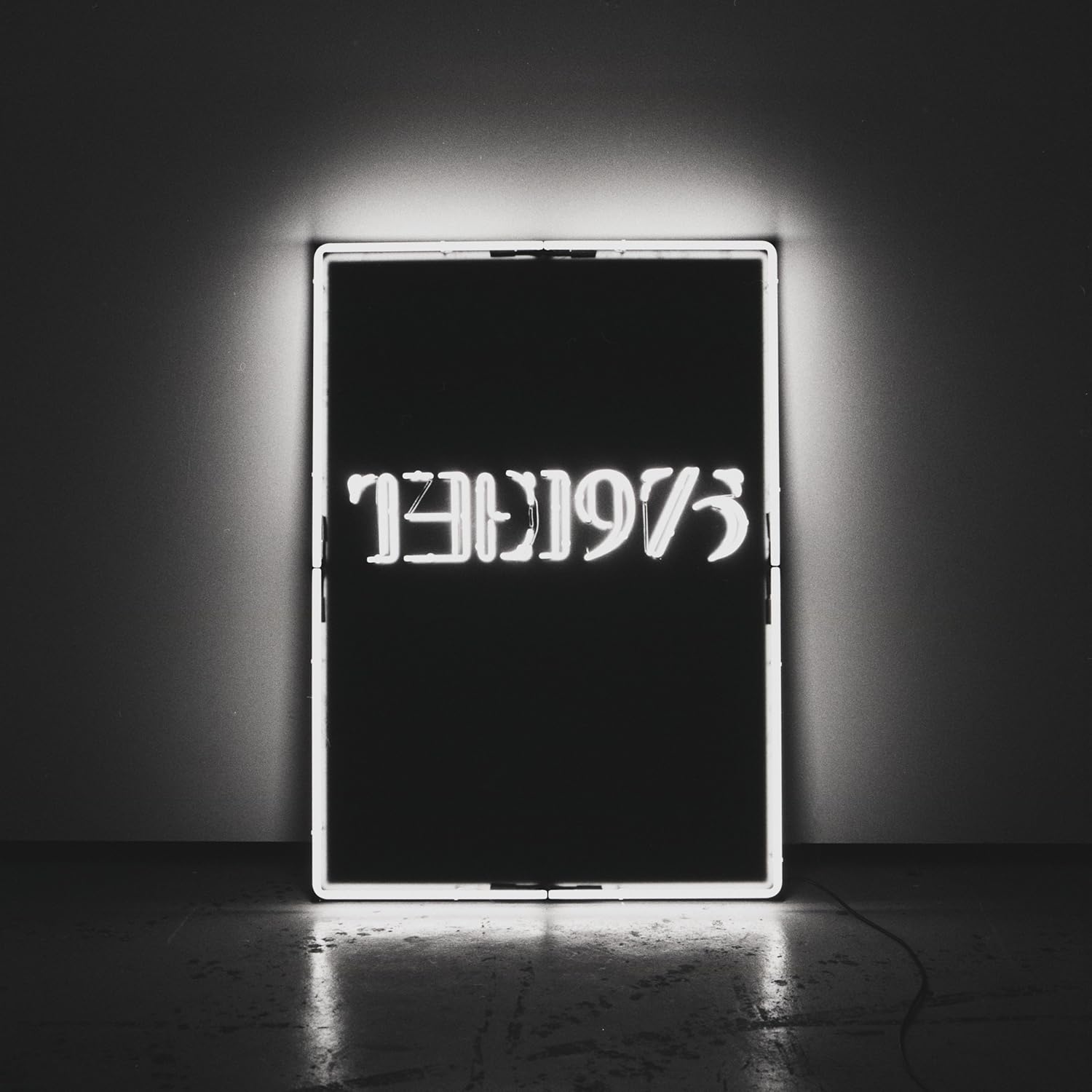
The 1975: The 1975 (Indie/Pop genre)


From this I made a very rough design to start off with, which I would get feedback from the group after. It was very basic, with the blue texture used on the front cover, with 10 tracks, along with a bar code and text to imitate the institutional text at the bottom.


For the inside covers we decided we wanted to use photograph(s) of the band taken in the studio. It is conventional to have a photo of the band on inside cover. We chose to have a playful photo of the band on the inside, because it would reflect the band's brand better.

Here is an example:

The 1975: The 1975 (Indie/Pop genre)

Inside covers for The 1975 album

We looked through the photos we had taken and found the photo below from the music video shoot, which we all agreed was nice for the digipack. The colours are different to the front cover, but the pale pink matches the pale tone of the whole cover and the pink makes it more interesting and more fun, which is the mood we are trying to connote.

The image had to be photoshopped before it went on the digipack, which was my job. I made the band slightly brighter, filled in the whole wall with the pink colour, made the floor brighter/cleaner and tried to hide the dark line separating the floor and wall.


Once the inside cover was photoshopped and the back cover was roughly designed, we had a group feedback session using Facebook, on top of a feedback session in person to improve the back cover.


From the online meeting we concluded that the overall cover was nice, but with a preference to the left image, because the inside photograph was smaller and looked nicer.