


http://www.bene.be/blog/comments/15_textures_for_download
http://www.bittbox.com/freebies/free-high-res-texture-pack-the-anatomy-of-a-really-old-book

http://www.mayang.com/textures/Fabric/html/Patterned%20Fabric/index.html

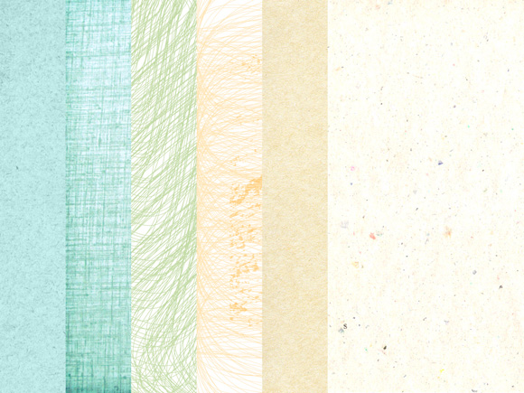
Then using these textures, I experimented using Photoshop and some of the features it has to manipulate the photographs and create different looks. The first three designs are unfinished don't have the title or album name because I was only testing the effects on the photo. My favourite are the first two because they clearly connote the indie genre and they are interesting to look at.


I made some more designs after that, with a different texture and mood completely. I like the effect of the yellow in the background coming off on the photo, which looks like paint. I tried to incorporate colour scheme into these ones. However it's quite loud and conveys more of a punk-rock genre rather than indie.


Gavin's First Designs
Gavin created some of his own designs using similar ideas to textures. He used a different font and experimented with block colour and shapes.


From creating these initial designs we were able to have a starting point for the album cover. We can now use the ideas from some of these designs and channel them into a few designs that we all like.
Using design ideas from our past experiments, I created some more album designs. I tried to use different publicity shot types (mainly ones with white backgrounds as that's what our shots will have).
My Second Group of Designs
 |
| 1 |
 |
| 2 |
 |
| 3 |
 |
| 4 |
 |
| 5 |
 |
| 6 |
 |
| 7 |
 |
| 8 |
My favourites are numbers 2,3,6 and 8. I like the paper textures and the effect I used on the image. However, when I showed the group my designs, Gavin pointed out that the logo I used was very visually similar to the band Muse's logo, therefore we decided to change it.
 |
| Muse's band logo |
I took into account the comments that the group made. Gavin, Mahalia and I then created a completely new cover, not including the lines. I liked the 'scrapbook effect' so we tried to use more paper textures and we also used a filter on the picture to add contrast to it. Lastly we used a clipping mask to create a cut-out effect.
 |
| 9 |
After we made the design above, Gavin and I made a few more to make the whole image feel less 2D. In images 10 and 11, we added shadows, in the first it was a black which we liked but thought was a bit too dark for the overall colour scheme of the album. From this we then created the second one which had a shadow using the paper the texture from the back. We then tried to reposition the words and use a different focal image.
 |
| 10 |
 |
| 11 |
 |
| 12 |
No comments:
Post a Comment