


Our Website
 ^Click Image to go to Our Website in a New Tab
Tuesday, 21 October 2014
Production Meetings: Week of 20 - 25 October
This week we were preparing for our first shoot so we had to get the preparation documents sorted for our shoot such as the shoot board, call sheet and final props list. We also had to have a tutorial for using the lighting kit and camera, to ensure we used the technology safely and correctly when we shot our video.
Animatic
For our group's animatic, the structure was put into four parts using the size and scale of props as dividers (see props post). We added captions to each of the drawings to make clear to the viewer what was happening in the shot and the type of shot.
Feedback we got on the animatic was that we could possibly speed up some of the shots towards the end of the music video and use fast-paced editing to add to the visual progression.
Monday, 20 October 2014
Fonts Research
I did some research on fonts and came up with a list of nine that I liked, which are downloadable from Dafont.com. I've created a live link that takes you straight to the page of the font on the website (which is mainly for the group to have a reference back to the page).
We looked mainly at some bold Sans Serif fonts which we found were typical of indie bands, as discovered in our album cover inspiration, like Vampire Weekend and Dan Croll.
PrimetimeWe looked mainly at some bold Sans Serif fonts which we found were typical of indie bands, as discovered in our album cover inspiration, like Vampire Weekend and Dan Croll.
 |
| Vampire Weekend - 'Horchata' |
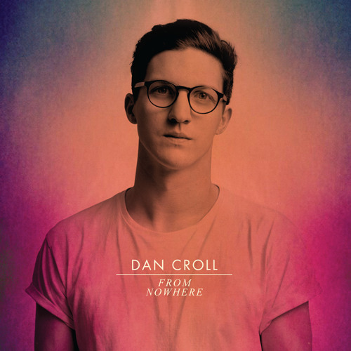 |
| Dan Croll - From Nowhere |
This is the initial list of our favourite fonts from the website. We will experiment with several of these on different designs and flatplans of the album cover to find which one we think fits best. My personal favourites are Couture, Cocogoose, Triomphe and Alte Haas Grotesk.


Triomphe *


Tuesday, 14 October 2014
Publicity Shots Inspirations
We researched into some publicity shots of bands with a similar brand image. The publicity shots will appear on the album cover and throughout the band website.
Bombay Bicycle Club
 |
| Bombay Bicycle Club |
We liked the Bombay Bicycle Club shot because they don't look like they are posing much and are in a natural setting. We liked their outfits and the 'natural' lighting of the shot.
Vampire Weekend
  |
| Vampire Weekend |
We liked the first shot because it was shot in a studio with high-key lighting, like our publicity shots will have. We liked the second shot for the funny poses, the costumes and use of fun props like mugs and food.
Paramore  |
| Paramore |
 |
| Paramore |
 |
| Paramore |
 |
| Paramore |
We liked the Paramore publicity shots for the strong use of colour schemes (red, black and white), which we will utilise for our publicity shots but with our own colour scheme. They incorporated the colour scheme into the costumes and settings of the photos. We also liked the quirky and indie poses that they're doing.
|
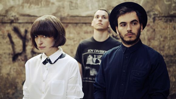
Clean Bandit
 |
| Clean Bandit |
 |
| Clean Bandit |
 |
| Clean Bandit |
We liked the Clean Bandit shots for the fun props, poses and mood it portrays. For example in the photograph with the bubbles they are all smiling and look like they're having fun. We would like to convey a similar mood in our photographs.
Daughter
 |
| Daughter |
We took inspiration from this band mainly because they were a three-piece band with a girl and two boys like us. We also liked the muted colour scheme with very high contrasts. It is also very obvious that they are an indie band, which we need to convey too.
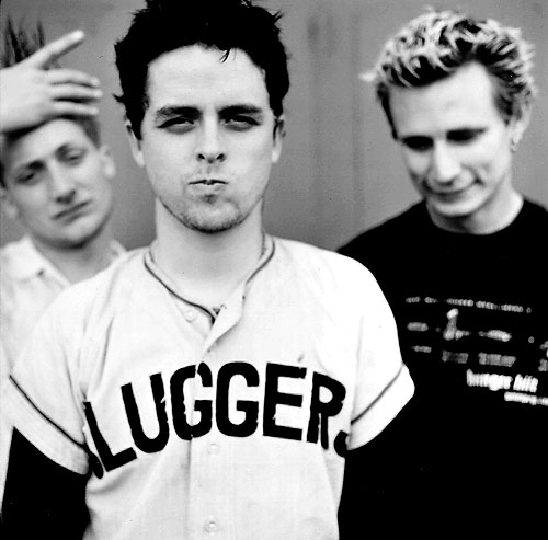
Greenday |
| Green Day |
 |
| Green Day |
We liked these shots mainly because they are a three-piece band but also for the fun mood. The lead (in the centre of both photos) is pouting in both pictures, giving the audience the feeling that they're not a serious band and have a fun side.
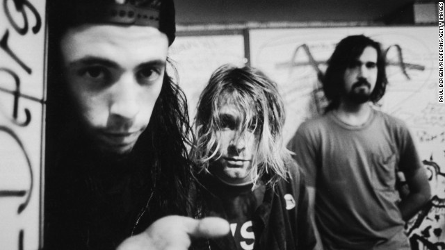
Nirvana
 |
| Nirvana |
 |
| Nirvana |
We liked the Nirvana shots only for the composition of the three-piece band. For example the use of foreground and background in the first shot and the use of space and high angle in the second shot.
Monday, 13 October 2014
Album Cover Influences
Before we create our album cover, we decided to make a collection of particular fonts, styles and album covers. This is so we could take influence from them, especially from the conventions, making the designing process for us.
Below the image is an explanation of why we were inspired.
Front Covers
 |
| White text, arranged nicely with a box to highlight and separate the middle text from the rest |
 |
| White text, separated with a line |
 |
|
 |
| Typeface used, white line separating two texts |
 |
| The white frame surrounding image and the typeface used |
 |
| Use of white frame around blue box, but also the image of the artist breaking the barrier of the frame creating different layers within the cover |
 |
| Frame within a frame and the textured border |
 |
| Black frame, distinctive colour scheme and striking font |
 |
| Use of filters to create a textured appearance and white typeface used and positioned in the centre of the cover |
 |
| Alternative and different use of images within text |
 |
| Use of colour scheme and plays around with images and shapes |
 |
| Distinctive colour scheme and nice use of space and layout |
 |
| Use of frames and centred text, simple but nice typeface and noticeable colour scheme |
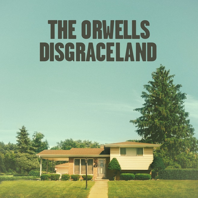
BACK COVERS
Vampire Weekend: Contra
 |
| Alternative but striking layout of text |
Arctic Monkeys: AM
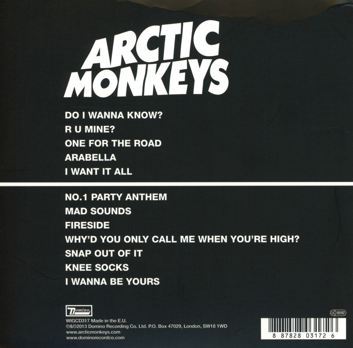 |
| Simple layout, constancy of colour scheme, minimalistic |
Clean Bandit: New Eyes
 |
| Use of large focal image of their band logo, track listings put to the side rather than the middle, consistent colour scheme |
Overall some of the characteristics that we liked from the majority of these images, that we may use in our final cover are:
- Sans Serif, bold typeface
- Clearly defined colour scheme (with maybe muted colours, such as the Lewis Watson front cover)
- Lines, frames and borders
- Block colours to create different sections of the cover
- Image(s) of the band
Production Meetings: Week of 13 - 20 October
This week our main goal was to finish the story board and animatic however we also wanted to get started on the album too.
 |
| Agenda for the week |
For the album cover, first we wanted to find some influences to gather fonts, styles and layouts that we thought were conventional to the indie genre and were interesting.
We came up with a list and then also made a short list of characteristics we want for our album cover.
 |
| Influential Album Cover Notes |
We made a few sketches on paper, but then started experimenting straight onto Photoshop because it was much easier to convey the creativity of our ideas that way.
 |
| Some of Our Album Cover Sketches |
We also had a hair and make-up tutorial from one of our past students who told us how to style our band on the days of the shoot and some useful techniques and tricks to make styling easier and more effective.
 |
| Make-up Tutorial Notes |
We also finished our storyboard and shot list, which meant we could begin our animatic. By making a storyboard, we were able to put down all the ideas of shots we had down and have it all in front of us.
 |
| Our storyboard |
Once we finished the storyboard we took pictures of each drawing and put them together into a video with the music, to help us visualise the music video.
 |
| Our storyboard key |
We also colour coordinated the different types of shots with different colours and then made a key to differentiate between them. This helped us to see if we had too many or too little of one type of shot, so we could spread it out,
After the storyboard was done Mahalia and I started on the shot list so that we could begin on the shoot schedule.
 |
| First page of two, of the shot list |
Subscribe to:
Posts (Atom)