Before we create our album cover, we decided to make a collection of particular fonts, styles and album covers. This is so we could take influence from them, especially from the conventions, making the designing process for us.
Below the image is an explanation of why we were inspired.
Front Covers
 |
| White text, arranged nicely with a box to highlight and separate the middle text from the rest |
 |
| White text, separated with a line |
 |
- Grey banner-like box on separating the cover into two parts, which highlights the white text
- White line separating two texts
- Thin, white border framing the album, giving it more than one layer
- 'Unposed', relaxed photo of the band in 'natural' light
|
 |
| Typeface used, white line separating two texts |
 |
| The white frame surrounding image and the typeface used |
 |
| Use of white frame around blue box, but also the image of the artist breaking the barrier of the frame creating different layers within the cover |
 |
| Frame within a frame and the textured border |
 |
| Black frame, distinctive colour scheme and striking font |
 |
| Use of filters to create a textured appearance and white typeface used and positioned in the centre of the cover |
 |
| Alternative and different use of images within text |
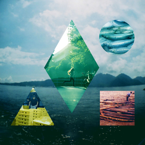 |
| Use of colour scheme and plays around with images and shapes |
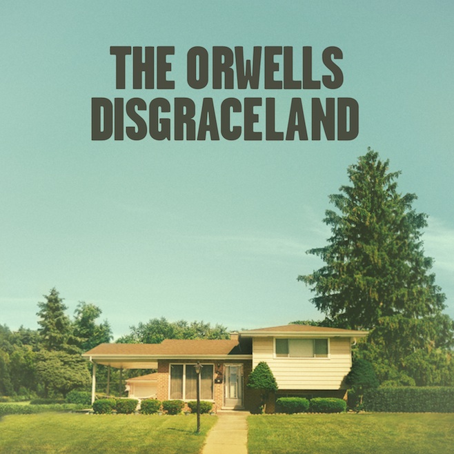 |
| Distinctive colour scheme and nice use of space and layout |
 |
| Use of frames and centred text, simple but nice typeface and noticeable colour scheme |
BACK COVERS
Vampire Weekend: Contra
 |
| Alternative but striking layout of text |
Arctic Monkeys: AM
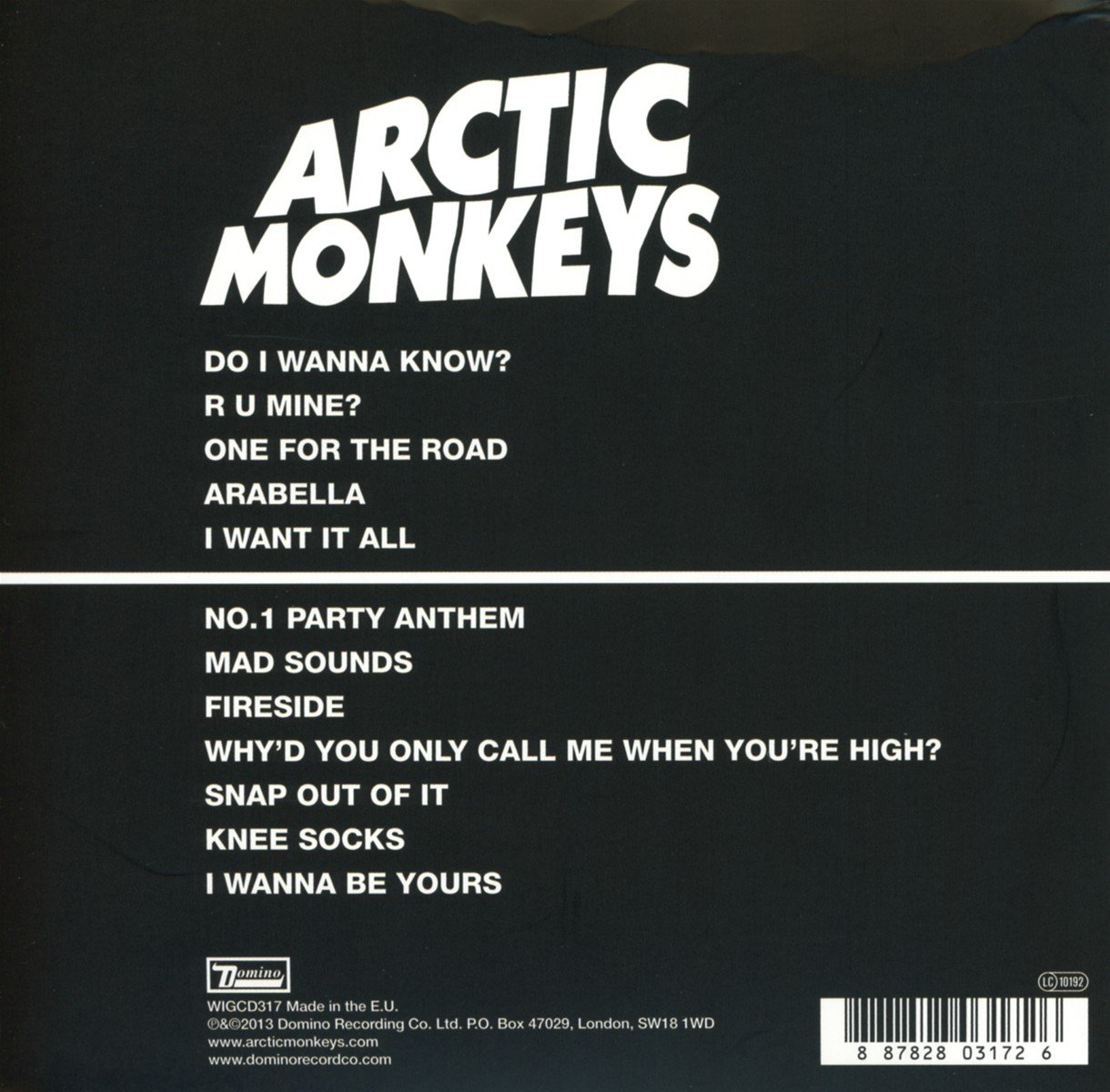 |
| Simple layout, constancy of colour scheme, minimalistic |
Clean Bandit: New Eyes
 |
| Use of large focal image of their band logo, track listings put to the side rather than the middle, consistent colour scheme |
Overall some of the characteristics that we liked from the majority of these images, that we may use in our final cover are:
- Sans Serif, bold typeface
- Clearly defined colour scheme (with maybe muted colours, such as the Lewis Watson front cover)
- Lines, frames and borders
- Block colours to create different sections of the cover
- Image(s) of the band


No comments:
Post a Comment