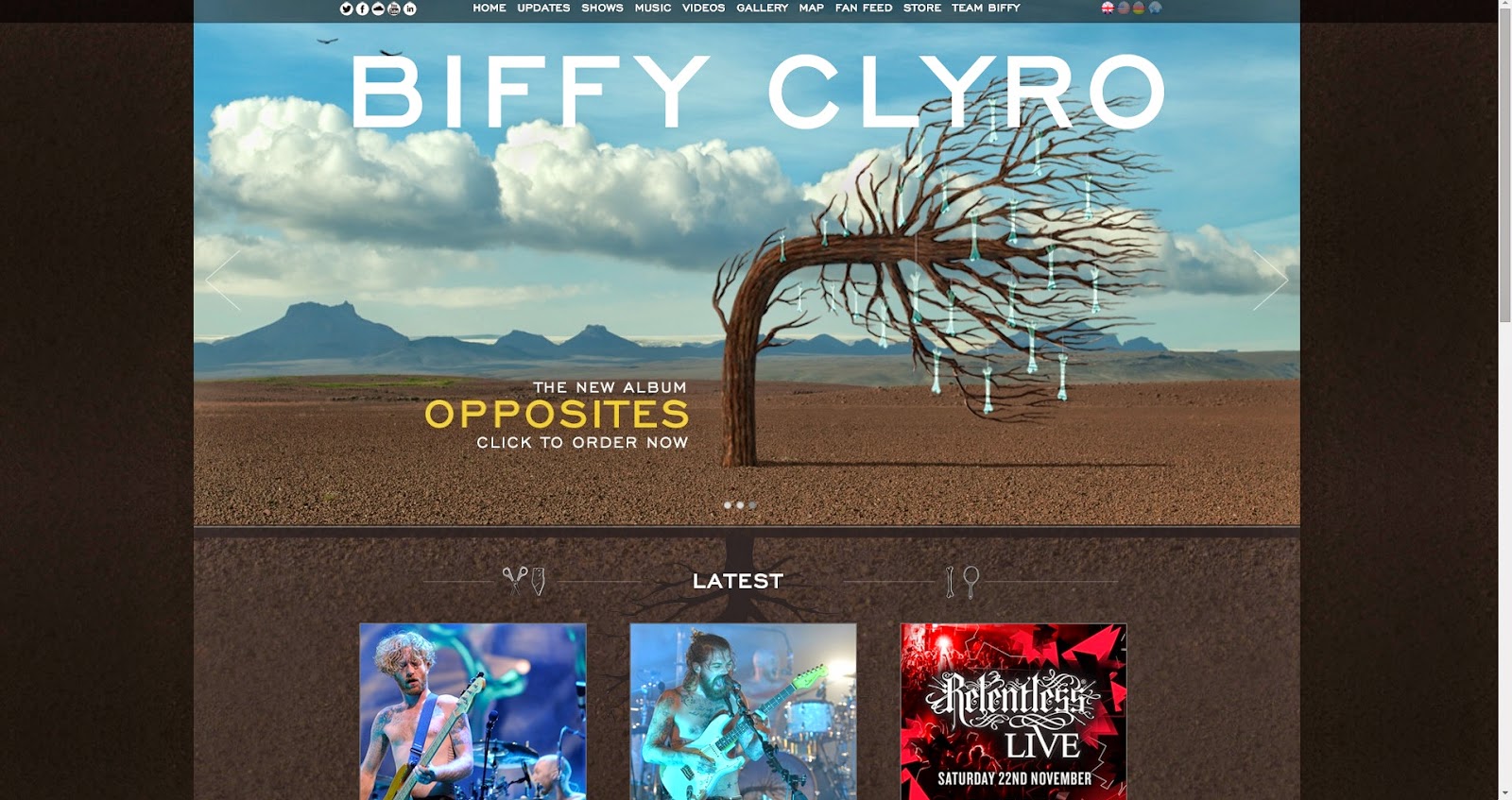
We during our production meeting we looked at different websites and noted the features that we liked and could transfer onto our own artist website. I've created a live link that takes you straight to the website above the website image when you click it.
We liked this website because of its strong and synergistic use of their black and white colour scheme throughout the website (and the brand) to match with the colours of the album. We liked how the website is very visual and includes lots of pictures of the band and their work, which clearly portrays their image of a cool, indie band. Lastly we liked the layout and non-linear,'blocky' format which resembles a non-linear blog-style website.
We mainly like Biffy Clyro's website for using pictures of their new album and them throughout the website, even more than The 1975. They used a picture of their album for the background, which strongly promotes their brand and new album to the user, which we might incorporate into our website as it will be our debut album and we will need to promote it. We also liked the non-linear format used, especially on the music page, making browsing easier for the user as they can see everything in front of them and can choose to look at what they like.
The Dan Croll website is really simple but still effective. There are only a few necessary pages on the website such as live dates, links to social media and links to his album and videos on Youtube. The website's background is plain white with grey text but the colourful banner promoting his album stands out. We also liked the Sans Serif typeface used throughout. Overall we felt this website was easy to navigate due to its simplicity and would like to embody this characteristic in our band's website.
We liked this website mainly for the unique menu bar and simplicity. However it may be a bit too simple and doesn't promote the band enough for us to take influence for our website, because Radiohead are a famous band and have an established fan base, we on the other hand need to create a fan base by making our website more inviting than this to attract an audience.
We liked this website because it used a non-linear format, but did it slightly differently and made the website look more visual and used very little text. We may use a format similar to this because it would help us to keep the user interested and help us to establish our brand more easily through visuals.
When you enter the website, you are faced with a picture of the album with a link to purchase it. We want to take influence off of this and have a landing page because it promotes the album directly to the user, the David Bowie page also did this. We also liked the fonts used throughout the website along with the colour scheme, background image and use of lines to divide the text. We felt that it clearly connoted the genre. However we didn't like the linear blog-style format they used because the user would have to scroll through posts that didn't interest them which may cause them to lose interest in the site and leave.
We liked this website because it had a simple colour scheme and had a consistent layout and theme. I liked the background image they used. I like the use of the 'blocky' theme. However we didn't like the linear layout of the website for the same reason as the Dog Is Dead website.
Our group was really interested by the use of colour scheme. When you hovered over the colour of page name on the menu bar the whole page turned that colour. We also liked the overall layout which is different to most websites, as the menu bar is typically lined up at the top of the page as a bar. The picture of the fly which dominates half of the page promotes their latest album, which we really liked. Lastly, the use of empty space on the page is really intriguing, as most pages try to use up the majority of the space.


No comments:
Post a Comment