After finishing the front of the album cover, we moved onto the back and inside of the digipack. For the back, we wanted to keep the consistent blue texture used on the front cover. Having a symbiotic relationship between the front and back covers are typical of album covers, especially of the indie genre.
Another convention of most indie album back covers was small, simple text for the track names.
Lastly, there was the conventional institutional information we had to include, such as the copyright and record label, plus the barcode and the artist website.
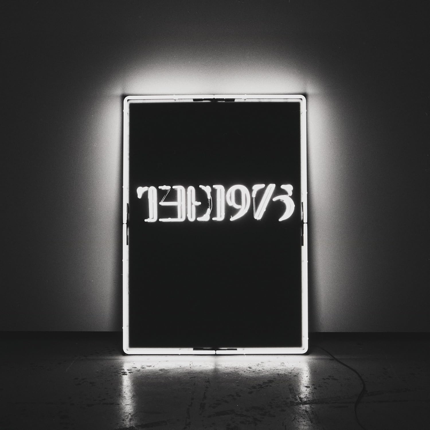
Here are a few examples of album cover backs we took influence from (with the front for reference):
Dan Croll: Sweet Disarray (Indie genre)
The 1975: The 1975 (Indie/Pop genre)
From this I made a very rough design to start off with, which I would get feedback from the group after. It was very basic, with the blue texture used on the front cover, with 10 tracks, along with a bar code and text to imitate the institutional text at the bottom.
Another convention of most indie album back covers was small, simple text for the track names.
Lastly, there was the conventional institutional information we had to include, such as the copyright and record label, plus the barcode and the artist website.
Here are a few examples of album cover backs we took influence from (with the front for reference):
Dan Croll: Sweet Disarray (Indie genre)
The XX: xx (Indie genre)
The 1975: The 1975 (Indie/Pop genre)
From this I made a very rough design to start off with, which I would get feedback from the group after. It was very basic, with the blue texture used on the front cover, with 10 tracks, along with a bar code and text to imitate the institutional text at the bottom.
For the inside covers we decided we wanted to use photograph(s) of the band taken in the studio. It is conventional to have a photo of the band on inside cover. We chose to have a playful photo of the band on the inside, because it would reflect the band's brand better.
Here is an example:
The 1975: The 1975 (Indie/Pop genre)
We looked through the photos we had taken and found the photo below from the music video shoot, which we all agreed was nice for the digipack. The colours are different to the front cover, but the pale pink matches the pale tone of the whole cover and the pink makes it more interesting and more fun, which is the mood we are trying to connote.
The image had to be photoshopped before it went on the digipack, which was my job. I made the band slightly brighter, filled in the whole wall with the pink colour, made the floor brighter/cleaner and tried to hide the dark line separating the floor and wall.
Here is an example:
The 1975: The 1975 (Indie/Pop genre)
 |
| Inside covers for The 1975 album |
We looked through the photos we had taken and found the photo below from the music video shoot, which we all agreed was nice for the digipack. The colours are different to the front cover, but the pale pink matches the pale tone of the whole cover and the pink makes it more interesting and more fun, which is the mood we are trying to connote.
The image had to be photoshopped before it went on the digipack, which was my job. I made the band slightly brighter, filled in the whole wall with the pink colour, made the floor brighter/cleaner and tried to hide the dark line separating the floor and wall.
Once the inside cover was photoshopped and the back cover was roughly designed, we had a group feedback session using Facebook, on top of a feedback session in person to improve the back cover.
From the online meeting we concluded that the overall cover was nice, but with a preference to the left image, because the inside photograph was smaller and looked nicer.


No comments:
Post a Comment